
Goers & Senders Campaign 2022 – Destination Africa
October 31, 2022Jayne Agency – Ten Elements of Nonprofit Branding
November 5, 2022Transform Your Donation Landing Pages for Year-End Giving
This fall, you’ll probably be ramping up for year-end giving, hoping to maximize your reach and visibility through email marketing, direct mail, social media and maybe even an event or two. At least, I hope you will. But one thing that tends to fall through the cracks amidst all the hoopla surrounding this last quarter is your website, more importantly, your donation landing pages. Have you looked at it lately? It may be in great shape and fully prepared for all the donations that will pour in during November and December. Or it might be in need of a little TLC.
All your hard work driving supporters to your website to make a donation can be wasted if those supporters are faced with complicated and time-consuming donation pages once they get there. If donating isn’t easy, they’ll abandon ship and you’ll lose revenue—in an instant.
Now’s the time to get your donation pages ready for the holiday season. If I’m a donor heading to your site to make a year-end gift, here’s what I’m thinking:
Don’t Make Me Give You My First-Born to Donate
In other words, lose any unnecessary fields on your donation form. The more information you require, the more you kill your conversion rate. People are especially busy during the holiday season, so make giving quick and easy. When you’re done reading this, go to your site and try making a donation yourself. Is it painless? Or is it a pain? Now’s a good time to simplify your donation process if necessary.
Give Me One Single, Focused Call to Action
As much as I love your organization, I don’t want several options here about other things I can do, like sign up to volunteer, read your mission statement or watch a video. Those are all great things and I may have time later, but when I’m on your donation page, I’m there to do one thing: give you money. Keep my focus on the task at hand with a clear call to action.
Creating a Natural Conversation on Your Donation Landing Page
Every time you ask your site visitor for something – whether it’s a donation or just an email signup – you are entering a mental conversation. To increase the potential for success, it is important that the thought sequence of that conversation take place in the proper order.
Briefly imagine if you were approached by a stranger on the street, and they said, “Hey, my name’s Tim. Can I have your business card? I’m going to call you later!”
You probably would give this person a weird look, and think, “No way, I don’t know you! Of course you can’t have my contact information! Leave me alone.”
We would never give away something valuable to us, like our contact information, just because someone asks for it. The same is true online.
Not only does it matter how we ask, but the order in which we ask for someone’s information is crucial. When we ask for it out of order, we create anxiety in the mind of the person on the other side of the screen.
Let’s look at a couple of experiments we conducted with nonprofit organizations to help re-order the conversation in order to create a more logical flow, and increase conversions.
Getting the elements of your donation landing page in the right order
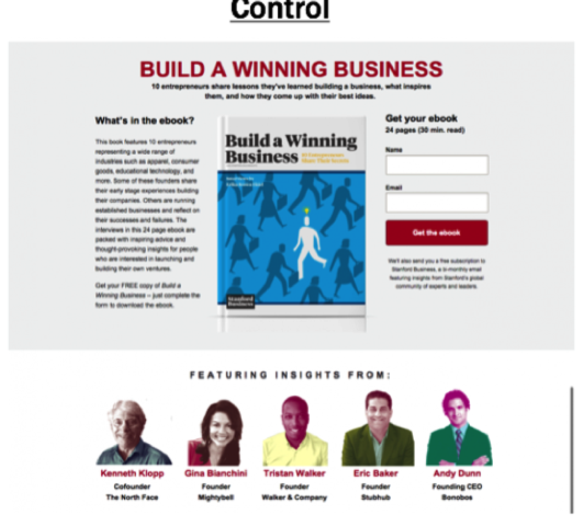
This is an email acquisition page for an e-book offer for a higher education organization. They have a good headline at the top of the page, and they use a three-column layout that mirrors their branding throughout the site. As you can see, they include third-party credibility indicators at the bottom of the page.
Do you notice any problems?
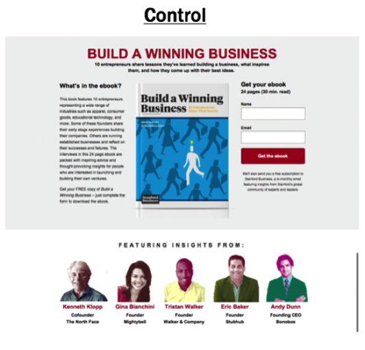
Notice your eye-movement as you work through page. A visitor has to read the copy in the first column, then move back to the top of the page to view the book, and then come back up again to complete the signup form. Up, down, up, down, up, down.
The horizontal layout forces you to slow down to work through the page, and affects the thought sequence leading to the final call-to-action.
We wondered if reorienting the thought sequence would affect the conversion rate on the page.
First, we put all these elements in a linear path from top to bottom on the page to create a more effective flow. We changed the headline to convey value, gave the copy contextual placement near the form, and moved the email acquisition form into the eye-path of the visitor. Then, we moved the book image and credibility indicators to the right column as supporting content. Below the first paragraph is the call-to-action restated as an opportunity to respond.
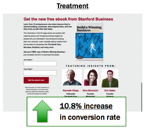
The treatment produced an increase in conversion by 10.8%.
From this experiment, we learned that matching branding throughout the site is not enough to influence someone to convert. We have to arrange the elements on a landing page so that they maximize the perceived value of an offer, and minimize the perceived cost.
Let’s look at another experiment.
Getting the thought sequence in the right order
This is an experiment that the Texas State Historical Association conducted on a landing page for an eBook download. The design below is something I call “above the fold.” For some reason, we’ve been taught to include all the important information in a header at the top of the page.
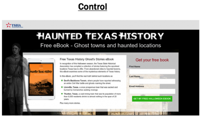
The “above the fold” idea was originally created for traditional newspapers so that a folded paper on a newsstand would still display the daily headlines. To see more, the reader has to physically pick up the paper and unfold it.
This problem doesn’t exist online, and yet, so often we follow this same practice! Scrolling up and down through a page is different than unfolding a newspaper, so our websites should function differently.
In this experiment, we reordered the elements on the page, removing the “above the fold” design and created a vertical sequencing path from top to bottom.
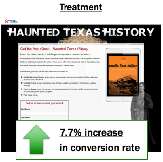
The treatment produced a 7.7% lift in conversion on the page.
What we learned from this experiment is that vertically stacking the elements on a landing page can help the reader to naturally flow through the conversation. It’s a natural behavior on a website to scroll down, so we should not be afraid of having elements placed “below the fold.”
Wrapping up…
Re-ordering page elements to create a top-to-bottom flow is a simple, easy change you can make on any page. Think of it like a real, face-to-face conversation you’re having with the person on the other side of the screen. It should be natural and have a logical flow.
The order of the conversation is crucial to establishing this flow. Don’t jump the natural sequencing process and require too much of your page visitors too early. This creates excess friction and anxiety in the mind of the user, and will cause them to abandon your page.
Do you think your donation landing page is optimized? Find out if there are elements on your landing page or donation page that are keeping your visitors from converting by taking the free friction self-assessment from NextAfter.
Looking for more resources to improve your donation landing page? Here are 5 Questions to Ask Yourself to Make Your Donation Page More Effective.
Authors
Tim Kachuriak
CEO & FOUNDER – NEXT AFTER
Tim Kachuriak is the founder and Chief Innovation and Optimization Officer for NextAfter, a fundraising research lab consultancy, and training institute that works with charities, nonprofits and NGOs to help them grow their resource capacity. A nonprofit thought leader, Kachuriak is the author of the book Optimize Your Fundraising, lead researcher and co-author of the Online Fundraising Scorecard, Why Should I Give to You? (The Nonprofit Value Proposition Index Study), and The Midlevel Donor Crisis. Kachuriak has trained organizations in fundraising optimization around the world and is a frequent speaker at international nonprofit conferences.
Kachuriak is also the co-founder and board member for the Human Coalition, a member of the board of directors for Open Doors USA, an Advisory Board Member for the SMU Digital Accelerator, and an Advisory Board Member for the Blackbaud Institute for Philanthropic Impact. Kachuriak lives in Prosper, TX with his wife Rebecca, and their four children: Max (14), Charlie (13), Gracie (11), and Joe (5).
Randy Hawthorne
FORMER ED & EDITOR – NONPROFIT HUB
As a Professional Certified Marketer, Randy shares his passions of marketing and education with nonprofits to help them implement marketing and organizational leadership principles so they can grow their organizations. Randy lends his marketing and organizational leadership expertise to a number of nonprofits in his community. Outside the office, Randy works with high school and college students and mentors young professionals to develop their leadership and entrepreneurial skills.
The post Transform Your Donation Landing Pages for Year-End Giving appeared first on Nonprofit Hub.
